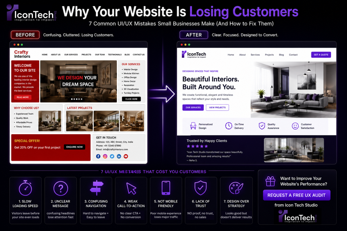
Why Your Website Is Losing Customers (Common UI/UX Mistakes Small Businesses Make)
Meta Description: Poor UI/UX silently kills conversions. Discover the 7 most common design mistakes costing small businesses sales—and how to fix them fast.
Have you ever looked at your website analytics and wondered:
"People are visiting my website... so why isn't anyone getting in touch?"
You're not alone.
Many small business owners assume that once their website is live, customers will naturally start calling, filling out contact forms, or making purchases.
But that's rarely how it works.
A website can look beautiful and still fail to convert visitors into customers.
Why?
Because good design isn't just about colours, animations, or fancy layouts.
It's about creating an experience that's simple, intuitive, and guides visitors toward taking action.
This is where UI (User Interface) and UX (User Experience) make all the difference.
In this article, we'll look at the most common UI/UX mistakes that quietly drive potential customers away—and more importantly, how you can fix them.
First, What Exactly Is UI/UX?
These two terms are often used together, but they mean different things.
UI (User Interface) is everything your visitors see—buttons, colours, typography, layouts, icons, and images.
UX (User Experience) is how visitors feel while using your website. Is it easy to navigate? Can they quickly find what they're looking for? Does the journey feel smooth or frustrating?
Think of it like walking into a physical store.
The interior design, lighting, and displays are the UI.
How easy it is to find products, ask for help, and complete a purchase—that's the UX.
A great website needs both.
Mistake #1: Your Website Takes Too Long to Load
Let's be honest.
When was the last time you waited 10 seconds for a website to load?
Probably never.
Your customers are no different.
If your website feels slow, many visitors won't wait—they'll simply leave and visit a competitor instead.
Common causes:#
- Oversized images
- Poor-quality hosting
- Too many plugins
- Unoptimized code
- Heavy animations
How to fix it#
- Compress images before uploading
- Use modern image formats like WebP
- Remove unnecessary scripts
- Choose reliable hosting
- Optimize your website for speed
A faster website doesn't just improve user experience—it can also improve your search engine rankings.
Mistake #2: Visitors Don't Know What You Actually Do
This happens more often than you'd think.
Some websites look amazing, but after 15 seconds, visitors still can't answer one simple question:
"What does this business actually offer?"
Your homepage should immediately communicate:
- Who you are
- What you do
- Who you help
- Why someone should choose you
If visitors have to scroll, guess, or click through multiple pages before they understand your business, many won't stick around.
Before#
"Innovative Digital Experiences."
Looks impressive.
But it doesn't explain anything.
After#
"We design high-performing websites and mobile apps that help businesses generate more leads and grow online."
Simple.
Clear.
Effective.
Mistake #3: Your Navigation Is Confusing
Imagine walking into a supermarket where nothing is labelled.
That's exactly how confusing website navigation feels.
Visitors shouldn't have to think about where to click next.
Keep your navigation simple.
A typical small business website usually only needs:
- Home
- About
- Services
- Portfolio
- Blog
- Contact
If your menu has dozens of links, dropdowns inside dropdowns, or unclear labels, you're creating unnecessary friction.
Mistake #4: Your Call-to-Action Isn't Clear
Every page on your website should answer one question:
"What do you want the visitor to do next?"
Unfortunately, many websites don't answer that.
If someone likes what they see but can't quickly figure out how to contact you, request a quote, or book a consultation, you've likely lost a potential customer.
Good call-to-action buttons include:
- Get a Free Quote
- Book a Consultation
- Start Your Project
- Contact Our Team
- Schedule a Call
Make them visible.
Repeat them throughout the page.
And make sure they're easy to tap on mobile devices.

Mistake #5: Your Website Isn't Designed for Mobile Users
Today, most people discover businesses on their phones—not their desktops.
Yet many websites are still designed desktop-first and only adjusted later for mobile.
This often leads to:
- Tiny text
- Buttons that are hard to tap
- Images that don't fit properly
- Horizontal scrolling
- Slow loading times
At Icon Tech Studio, we follow a mobile-first design approach, meaning every website is designed for smartphones first before being adapted for larger screens.
Because that's where most of your customers are.
Mistake #6: There's No Trust
Imagine visiting a website that has:
- No testimonials
- No portfolio
- No reviews
- No business information
- No contact details
Would you feel confident spending money there?
Probably not.
Trust is one of the biggest factors in online conversions.
Simple additions like:
- Client testimonials
- Google Reviews
- Case studies
- Certifications
- Team photos
- Real project screenshots
can make a huge difference.
People buy from businesses they trust.
Mistake #7: You're Focusing on Design Instead of Results
Many business owners ask for:
- Fancy animations
- Complex effects
- Trendy layouts
Those things can certainly enhance a website—but only when they support the user experience.
A beautiful website that confuses visitors won't generate enquiries.
A simple website that clearly communicates your value and makes it easy to take action often performs much better.
Good design isn't about showing off.
It's about helping users achieve their goals with as little effort as possible.
How to Know If Your Website Has a UX Problem
Ask yourself these questions:
- Are people visiting but not contacting you?
- Is your bounce rate unusually high?
- Do visitors leave within a few seconds?
- Are contact forms rarely submitted?
- Are customers calling to ask questions that your website should already answer?
If you answered "yes" to several of these, your website may have a user experience problem rather than a traffic problem.
Why Good UI/UX Is an Investment—Not an Expense
Improving your website's user experience isn't just about making it look better.
It can lead to:
- Higher conversion rates
- More enquiries
- Better search engine performance
- Increased customer trust
- Lower bounce rates
- More repeat visitors
Sometimes, small design improvements can have a bigger impact than spending more money on advertising.
There's no point paying to bring people to your website if the experience encourages them to leave.
Why Businesses Choose Icon Tech Studio
At Icon Tech Studio, we believe every design decision should support a business goal.
We don't create websites just because they look modern.
We create websites that help businesses generate leads, build trust, and deliver a better experience for every visitor.
Our UI/UX design process focuses on:
✅ Understanding your customers first
✅ Mobile-first design principles
✅ Fast-loading, high-performance websites
✅ Clear navigation and user journeys
✅ Conversion-focused layouts
✅ Modern, scalable design systems
Whether you're launching a new website or redesigning an existing one, our goal is simple:
Create an experience your customers enjoy—and one that helps your business grow.
Final Thoughts
Your website may be getting plenty of visitors.
But if those visitors aren't becoming customers, the problem isn't always your marketing.
Sometimes, it's the experience you're giving people after they arrive.
The good news?
Most UI/UX problems are fixable.
A few thoughtful improvements to your layout, navigation, speed, and messaging can make a noticeable difference in how visitors interact with your website.
Remember, your website isn't just there to look good.
It's there to help your business grow.
Request a Free UX Audit
Not sure whether your website is helping or hurting your business?
We'll take a look and provide honest, practical feedback—no pressure, no technical jargon, and no obligation.
Request a free UX audit from Icon Tech Studio, and discover simple improvements that could help turn more of your website visitors into paying customers.